Rebranding and Modernizing the Look and Feel of an Established, Healthcare-focused PR Agency
A modernized brand identity system for a mission-driven PR agency specializing in healthcare and pharma.


Rebranding and Modernizing the Look and Feel of an Established, Healthcare-focused PR Agency
The Ask
After years of operating under a well-recognized but dated identity, MCS Healthcare sought a refreshed visual system to reflect its growth, relevance, and leadership in pharmaceutical communications.
The rebrand needed to strike a delicate balance: maintaining continuity for long-time partners while signaling boldness and precision to new clients and prospects.
The Challenge
Healthcare communications require a tone of seriousness and reliability, but MCS also wanted to show creativity and warmth.
The old visual identity lacked versatility, and there were no formal brand guidelines, which led to inconsistencies across internal documents, digital touchpoints, and pitch materials.
We needed to create a flexible system that could work across print, web, PowerPoint, and day-to-day internal comms — all while keeping the rollout manageable for a mid-sized agency.
Rebranding and Modernizing the Look and Feel of an Established, Healthcare-focused PR Agency
The Solution
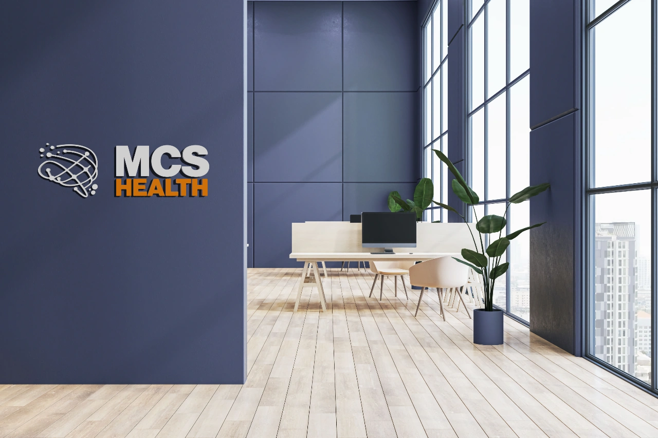
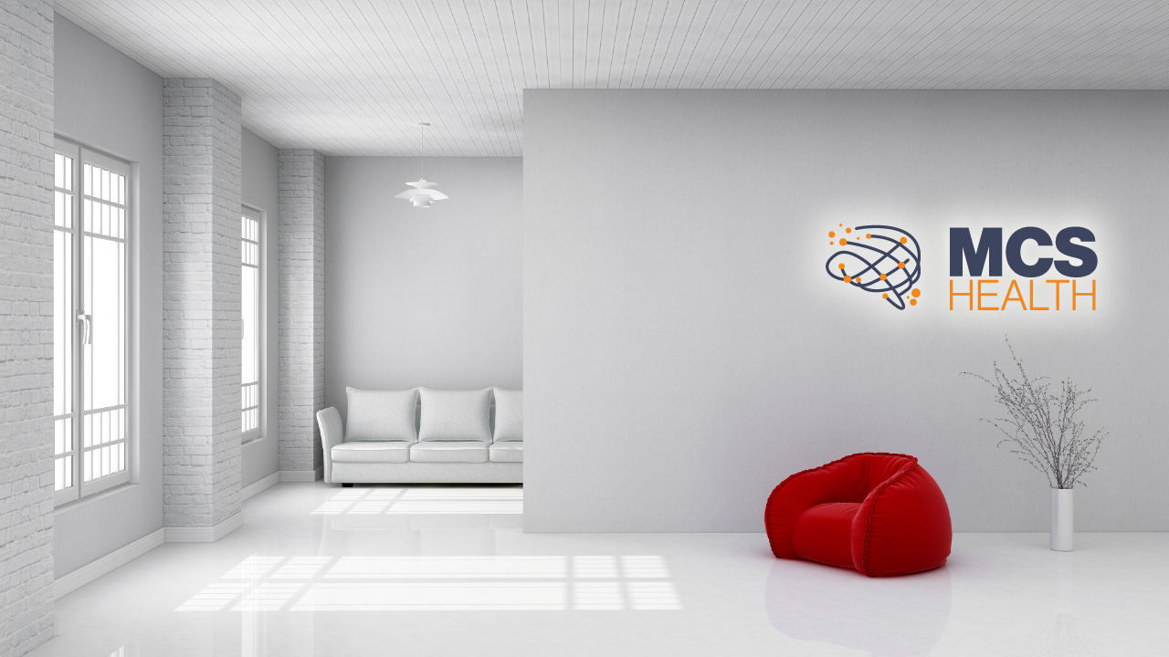
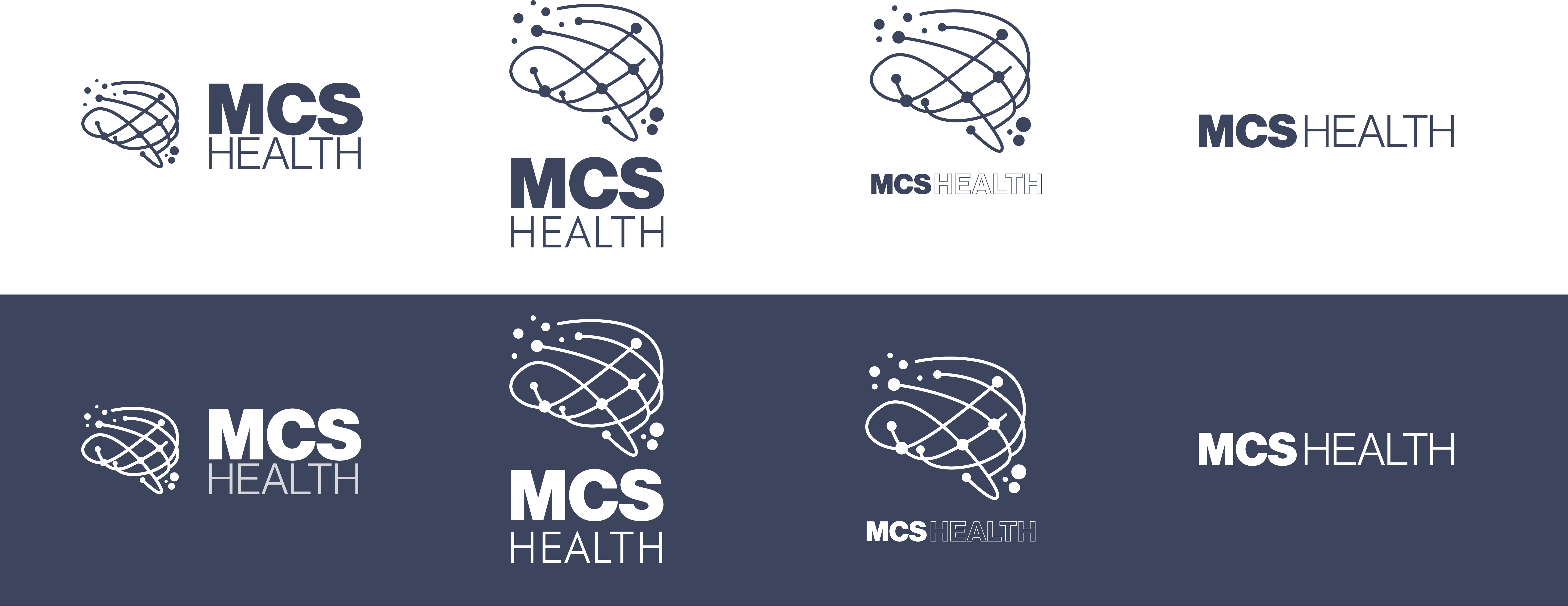
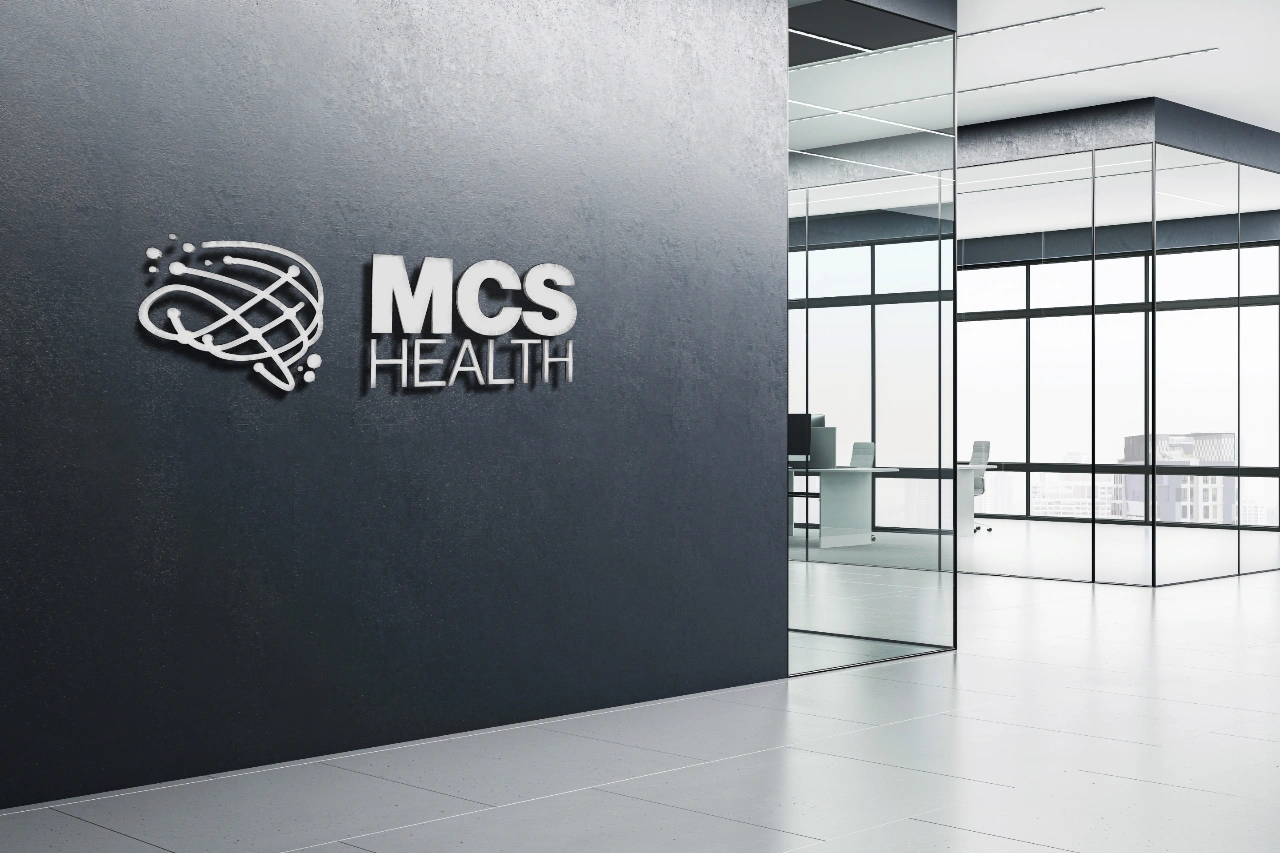
We developed a modernized brand identity that preserved the legacy color palette but sharpened its contrast and hierarchy.
The updated logo introduced clean typography and spacing, while a supporting visual system was built around modular layouts, flexible templates, and branded iconography.
We also created an internal style guide and designed a series of presentation and document templates for the MCS team, enabling immediate adoption across departments.
The Outcome
The refreshed identity improved brand consistency and confidence, internally and externally.
Teams found it easier to create visually strong deliverables, and leadership reported increased enthusiasm from both clients and staff. The rebrand helped MCS present a unified front across pitches, partnerships, and hiring — strengthening their position as a top-tier healthcare communications partner.
More case studies.
If you liked what you've seen, here are a few more you might be interested in!
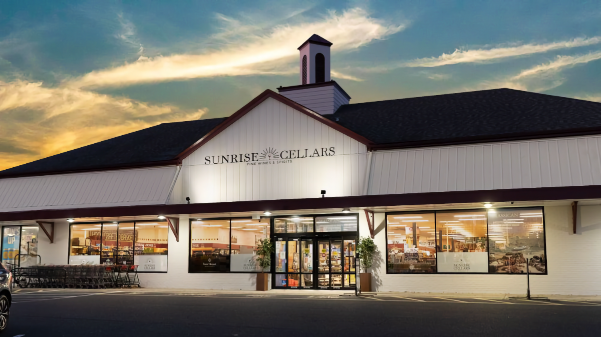
Rebranding Old Wine Stores to Become a Future-proof high-end, One-Stop Shop for Wine Lovers
From supermarket aisle to boutique destination: I rebranded Sunrise Cellars into a premium wine store that celebrates discovery, craftsmanship, and everyday celebration.

Designing a Full Food Startup Brand that Looks just like an Established Company
The lovechild of sushi and a sandwich, NORIGAMI’s bold brand identity slices through the noise with playful icons, witty copy, and color-coded clarity — proving healthy grab-and-go can be fresh, fun, and undeniably irresistible.
