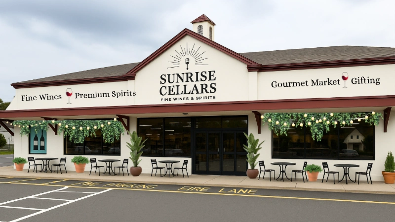
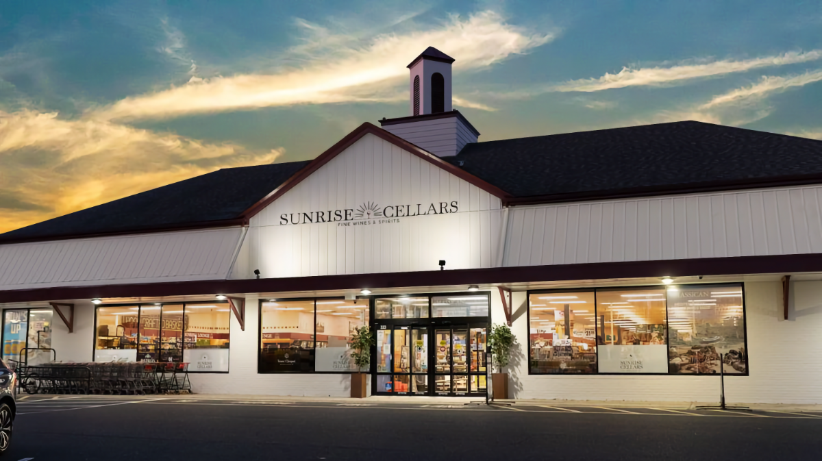
Building a new logo for Sunrise Cellars' wine stores
From supermarket aisle to boutique destination: I rebranded Sunrise Cellars into a premium wine store that celebrates discovery, craftsmanship, and everyday celebration.

Building a new logo for Sunrise Cellars' wine stores
The Ask
Rebrand two NJ wine shops into a boutique destination with a stronger identity, curated selection, and upgraded customer experience.
The Challenge
• Legacy branding tied to ShopRite made the stores feel generic
• Needed to stand out in a crowded retail market
• Website design and e-commerce lacked visual appeal and usability
• Customer perception didn’t reflect the curated, boutique-quality wine selection
Building a new logo for Sunrise Cellars' wine stores
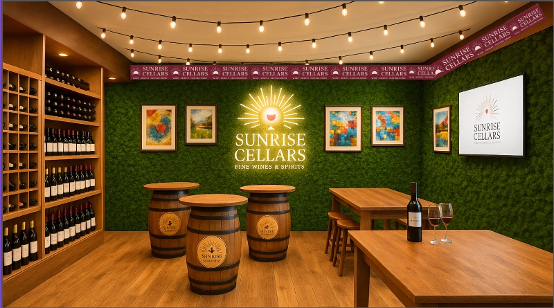
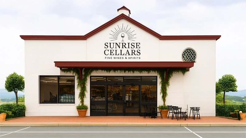
The Solution
• Developed new logo concepts inspired by sun, soil, and grapes
• Crafted a refined brand identity aligned with boutique positioning
• Redesigned e-commerce visuals for clarity, elegance, and conversion
• Curated wine promotions (organic, biodynamic, natural) with lifestyle-driven storytelling
The Outcome
Positioned Sunrise Cellars as a distinctive boutique wine destination, elevating the in-store and online experience while signaling expertise and curation to customers.
More case studies.
If you liked what you've seen, here are a few more you might be interested in!

Designing a Full Food Startup Brand that Looks just like an Established Company
The lovechild of sushi and a sandwich, NORIGAMI’s bold brand identity slices through the noise with playful icons, witty copy, and color-coded clarity — proving healthy grab-and-go can be fresh, fun, and undeniably irresistible.

Rebranding and Modernizing the Look and Feel of an Established, Healthcare-focused PR Agency
A modernized brand identity system for a mission-driven PR agency specializing in healthcare and pharma.
This is what happens when clients go all in.
The work only works when the chemistry does. If you’re looking for a creative partner who’s strategic, collaborative, and not afraid to push things further—let’s talk.